 Data Quality
Output Settings
Introduction
dataquieR provides many outputs ready to be integrated
with a quality report. However, users’ requirements are usually more
specific. This tutorial explains how to adjust dataquieR’s
main result types (data frames and promises of
ggplot2-graphics) to meet particular needs.
Example output of dataquieR
The basic example used in this documentation requires two objects,
which are mandatory for all dataquieR functions:
- study data, and
- metadata.
These are loaded from the dataquieR package:
options(rio.import.trust = TRUE) # Do only, if you trust the data source. Refer to `? rio::import`, section "Trust" for more explanations
sd1 <- prep_get_data_frame("https://dataquality.qihs.uni-greifswald.de/extdata/study_data.RData", keep_types = TRUE)
md1 <- prep_get_data_frame("https://dataquality.qihs.uni-greifswald.de/extdata/meta_data.RData")
The example output is generated using the dataquieR
function: com_item_missingness().
tab_ex1 <- com_item_missingness(study_data = sd1,
                                meta_data = md1,
                                threshold_value = 90,
                                include_sysmiss = TRUE)
This function generates four objects: SummaryTable, SummaryData,
SummaryPlot, ReportSummaryTable. The first two are data frames, and the
last two are ggplots. The following steps show how to edit
these objects.
Data frames
For the use of data frames in data quality reporting, there are two important aspects.
they should be displayed in a neat and comprehensible way. For this aspect, many packages exist, e.g.
xtable,kableExtra,pixiedust,huxtableandDT, each of which integrates with some of the most output formats supported byrmarkdown/pandoc, namelyhtml,docx,pdf, andflexdashbaord. For using these package, we ask the reader to refer to these packages’ documentation, please.Given the size of data frames there must be ways to filter or sort them, to add or remove columns, and to rename columns. For these issues a good choice is the
dplyrpackage from thetidyverse. The related packagetidyris useful for transforming tables from long to wide format.
The most simple output of the tab_ex1$SummaryTable data
frame is (only the 10 first lines are shown to reduce the file
size):
| Variables | Expected observations N | Sysmiss N | Datavalues N | Missing codes N | Jumps N | Measurements N | Missing_expected_obs | PCT_com_crm_mv | GRADING |
|---|---|---|---|---|---|---|---|---|---|
| CENTER_0 | 2940 | 0 | 2940 | 0 | 0 | 2940 | 0 | 0.00 | 0 |
| PSEUDO_ID | 2940 | 0 | 2940 | 0 | 0 | 2940 | 0 | 0.00 | 0 |
| SEX_0 | 2940 | 0 | 2940 | 0 | 0 | 2940 | 0 | 0.00 | 0 |
| AGE_0 | 2940 | 0 | 2940 | 0 | 0 | 2940 | 0 | 0.00 | 0 |
| AGE_GROUP_0 | 2940 | 0 | 2940 | 0 | 0 | 2940 | 0 | 0.00 | 0 |
| AGE_1 | 2940 | 0 | 2940 | 0 | 0 | 2940 | 0 | 0.00 | 0 |
| SEX_1 | 2940 | 0 | 2940 | 0 | 0 | 2940 | 0 | 0.00 | 0 |
| PART_STUDY | 3000 | 60 | 2940 | 0 | 0 | 2940 | 60 | 2.00 | 0 |
| SBP_0 | 2940 | 239 | 2701 | 140 | 0 | 2561 | 379 | 12.63 | 1 |
| DBP_0 | 2940 | 233 | 2707 | 163 | 0 | 2544 | 396 | 13.20 | 1 |
Styling
The table above comprises information regarding missing values of all
variables in the study data. Nevertheless, its readability can be
improved using functionalities from the kableExtra and
dplyr packages.
library(dplyr)
library(kableExtra)
kable(tab_ex1$SummaryTable, "html") %>%
kable_styling(bootstrap_options = c("hover"))| Variables | Expected observations N | Sysmiss N | Datavalues N | Missing codes N | Jumps N | Measurements N | Missing_expected_obs | PCT_com_crm_mv | GRADING |
|---|---|---|---|---|---|---|---|---|---|
| CENTER_0 | 2940 | 0 | 2940 | 0 | 0 | 2940 | 0 | 0.00 | 0 |
| PSEUDO_ID | 2940 | 0 | 2940 | 0 | 0 | 2940 | 0 | 0.00 | 0 |
| SEX_0 | 2940 | 0 | 2940 | 0 | 0 | 2940 | 0 | 0.00 | 0 |
| AGE_0 | 2940 | 0 | 2940 | 0 | 0 | 2940 | 0 | 0.00 | 0 |
| AGE_GROUP_0 | 2940 | 0 | 2940 | 0 | 0 | 2940 | 0 | 0.00 | 0 |
| AGE_1 | 2940 | 0 | 2940 | 0 | 0 | 2940 | 0 | 0.00 | 0 |
| SEX_1 | 2940 | 0 | 2940 | 0 | 0 | 2940 | 0 | 0.00 | 0 |
| PART_STUDY | 3000 | 60 | 2940 | 0 | 0 | 2940 | 60 | 2.00 | 0 |
| SBP_0 | 2940 | 239 | 2701 | 140 | 0 | 2561 | 379 | 12.63 | 1 |
| DBP_0 | 2940 | 233 | 2707 | 163 | 0 | 2544 | 396 | 13.20 | 1 |
| GLOBAL_HEALTH_VAS_0 | 2940 | 246 | 2694 | 76 | 0 | 2618 | 322 | 10.73 | 1 |
| ASTHMA_0 | 2940 | 227 | 2713 | 72 | 0 | 2641 | 299 | 9.97 | 1 |
| VO2_CAPCAT_0 | 2940 | 225 | 2715 | 120 | 0 | 2595 | 345 | 11.50 | 1 |
| ARM_CIRC_0 | 2940 | 220 | 2720 | 63 | 0 | 2657 | 283 | 9.43 | 0 |
| ARM_CIRC_DISC_0 | 2940 | 238 | 2702 | 69 | 0 | 2633 | 307 | 10.23 | 1 |
| ARM_CUFF_0 | 2940 | 236 | 2704 | 81 | 0 | 2623 | 317 | 10.57 | 1 |
| USR_VO2_0 | 2940 | 89 | 2851 | 69 | 0 | 2782 | 158 | 5.27 | 0 |
| USR_BP_0 | 2940 | 80 | 2860 | 85 | 0 | 2775 | 165 | 5.50 | 0 |
| EXAM_DT_0 | 2940 | 0 | 2940 | 0 | 0 | 2940 | 0 | 0.00 | 0 |
| PART_PHYS_EXAM | 2940 | 0 | 2940 | 0 | 0 | 2940 | 0 | 0.00 | 0 |
| CRP_0 | 2940 | 172 | 2768 | 69 | 0 | 2699 | 241 | 8.03 | 0 |
| BSG_0 | 2940 | 182 | 2758 | 72 | 0 | 2686 | 254 | 8.47 | 0 |
| DEV_NO_0 | 2940 | 248 | 2692 | 0 | 0 | 2692 | 248 | 8.27 | 0 |
| LAB_DT_0 | 2940 | 0 | 2940 | 0 | 0 | 2940 | 0 | 0.00 | 0 |
| PART_LAB | 2940 | 0 | 2940 | 0 | 0 | 2940 | 0 | 0.00 | 0 |
| EDUCATION_0 | 2924 | 72 | 2852 | 380 | 0 | 2472 | 452 | 15.07 | 1 |
| EDUCATION_1 | 2924 | 83 | 2841 | 416 | 0 | 2425 | 499 | 16.63 | 1 |
| FAM_STAT_0 | 2924 | 122 | 2802 | 413 | 0 | 2389 | 535 | 17.83 | 1 |
| MARRIED_0 | 2924 | 126 | 2798 | 432 | 0 | 2366 | 558 | 18.60 | 1 |
| N_CHILD_0 | 2924 | 160 | 2764 | 428 | 0 | 2336 | 588 | 19.60 | 1 |
| EATING_PREFS_0 | 2924 | 148 | 2776 | 448 | 0 | 2328 | 596 | 19.87 | 1 |
| MEAT_CONS_0 | 2924 | 171 | 2753 | 451 | 0 | 2302 | 622 | 20.73 | 1 |
| SMOKING_0 | 2924 | 183 | 2741 | 449 | 0 | 2292 | 632 | 21.07 | 1 |
| SMOKE_SHOP_0 | 2924 | 1605 | 1319 | 513 | 0 | 806 | 2118 | 70.60 | 1 |
| N_INJURIES_0 | 2924 | 244 | 2680 | 481 | 0 | 2199 | 725 | 24.17 | 1 |
| N_BIRTH_0 | 2924 | 213 | 2711 | 499 | 1113 | 1099 | 1825 | 60.83 | 1 |
| INCOME_GROUP_0 | 2924 | 235 | 2689 | 515 | 0 | 2174 | 750 | 25.00 | 1 |
| PREGNANT_0 | 2924 | 274 | 2650 | 519 | 1066 | 1065 | 1859 | 61.97 | 1 |
| MEDICATION_0 | 2924 | 1733 | 1191 | 550 | 0 | 641 | 2283 | 76.10 | 1 |
| N_ATC_CODES_0 | 2924 | 310 | 2614 | 556 | 0 | 2058 | 866 | 28.87 | 1 |
| USR_SOCDEM_0 | 2924 | 306 | 2618 | 332 | 0 | 2286 | 638 | 21.27 | 1 |
| INT_DT_0 | 2924 | 0 | 2924 | 0 | 0 | 2924 | 0 | 0.00 | 0 |
| PART_INTERVIEW | 2940 | 0 | 2940 | 0 | 0 | 2940 | 0 | 0.00 | 0 |
| ITEM_1_0 | 2864 | 317 | 2547 | 299 | 0 | 2248 | 616 | 20.53 | 1 |
| ITEM_2_0 | 2864 | 343 | 2521 | 324 | 0 | 2197 | 667 | 22.23 | 1 |
| ITEM_3_0 | 2864 | 355 | 2509 | 325 | 0 | 2184 | 680 | 22.67 | 1 |
| ITEM_4_0 | 2864 | 347 | 2517 | 374 | 0 | 2143 | 721 | 24.03 | 1 |
| ITEM_5_0 | 2864 | 416 | 2448 | 374 | 0 | 2074 | 790 | 26.33 | 1 |
| ITEM_6_0 | 2864 | 427 | 2437 | 389 | 0 | 2048 | 816 | 27.20 | 1 |
| ITEM_7_0 | 2864 | 395 | 2469 | 401 | 0 | 2068 | 796 | 26.53 | 1 |
| ITEM_8_0 | 2864 | 424 | 2440 | 427 | 0 | 2013 | 851 | 28.37 | 1 |
| QUEST_DT_0 | 2864 | 0 | 2864 | 0 | 0 | 2864 | 0 | 0.00 | 0 |
| PART_QUESTIONNAIRE | 2924 | 0 | 2924 | 0 | 0 | 2924 | 0 | 0.00 | 0 |
Paging (in R Markdown)
The table above is getting very long. Another possibility is to use
paged output for data frames. For this, under output in the YAML-header,
the line df_print: paged must be added. A simple call of
the data frame allows then browsing rows and columns.
Alternatively, you may use the DT package, For this, you
have to add a chunk like the following to your R-Markdown file:
library(knitr),
library(DT),
knitr::opts_chunk$set(echo = FALSE, message = FALSE, warning = FALSE),
knit_print.data.frame = function(x, ...) { knit_print(DT::datatable(x), ...) },
registerS3method("knit_print", "data.frame", knit_print.data.frame)
Remove columns
In some instances, removing a column is needed. For example, we could remove the Expected observations N column via the \(-\) operator:
tab_ex1$SummaryTable %>%
select(-'Expected observations N') | Variables | Sysmiss N | Datavalues N | Missing codes N | Jumps N | Measurements N | Missing_expected_obs | PCT_com_crm_mv | GRADING |
|---|---|---|---|---|---|---|---|---|
| CENTER_0 | 0 | 2940 | 0 | 0 | 2940 | 0 | 0.00 | 0 |
| PSEUDO_ID | 0 | 2940 | 0 | 0 | 2940 | 0 | 0.00 | 0 |
| SEX_0 | 0 | 2940 | 0 | 0 | 2940 | 0 | 0.00 | 0 |
| AGE_0 | 0 | 2940 | 0 | 0 | 2940 | 0 | 0.00 | 0 |
| AGE_GROUP_0 | 0 | 2940 | 0 | 0 | 2940 | 0 | 0.00 | 0 |
| AGE_1 | 0 | 2940 | 0 | 0 | 2940 | 0 | 0.00 | 0 |
| SEX_1 | 0 | 2940 | 0 | 0 | 2940 | 0 | 0.00 | 0 |
| PART_STUDY | 60 | 2940 | 0 | 0 | 2940 | 60 | 2.00 | 0 |
| SBP_0 | 239 | 2701 | 140 | 0 | 2561 | 379 | 12.63 | 1 |
| DBP_0 | 233 | 2707 | 163 | 0 | 2544 | 396 | 13.20 | 1 |
| GLOBAL_HEALTH_VAS_0 | 246 | 2694 | 76 | 0 | 2618 | 322 | 10.73 | 1 |
| ASTHMA_0 | 227 | 2713 | 72 | 0 | 2641 | 299 | 9.97 | 1 |
| VO2_CAPCAT_0 | 225 | 2715 | 120 | 0 | 2595 | 345 | 11.50 | 1 |
| ARM_CIRC_0 | 220 | 2720 | 63 | 0 | 2657 | 283 | 9.43 | 0 |
| ARM_CIRC_DISC_0 | 238 | 2702 | 69 | 0 | 2633 | 307 | 10.23 | 1 |
| ARM_CUFF_0 | 236 | 2704 | 81 | 0 | 2623 | 317 | 10.57 | 1 |
| USR_VO2_0 | 89 | 2851 | 69 | 0 | 2782 | 158 | 5.27 | 0 |
| USR_BP_0 | 80 | 2860 | 85 | 0 | 2775 | 165 | 5.50 | 0 |
| EXAM_DT_0 | 0 | 2940 | 0 | 0 | 2940 | 0 | 0.00 | 0 |
| PART_PHYS_EXAM | 0 | 2940 | 0 | 0 | 2940 | 0 | 0.00 | 0 |
| CRP_0 | 172 | 2768 | 69 | 0 | 2699 | 241 | 8.03 | 0 |
| BSG_0 | 182 | 2758 | 72 | 0 | 2686 | 254 | 8.47 | 0 |
| DEV_NO_0 | 248 | 2692 | 0 | 0 | 2692 | 248 | 8.27 | 0 |
| LAB_DT_0 | 0 | 2940 | 0 | 0 | 2940 | 0 | 0.00 | 0 |
| PART_LAB | 0 | 2940 | 0 | 0 | 2940 | 0 | 0.00 | 0 |
| EDUCATION_0 | 72 | 2852 | 380 | 0 | 2472 | 452 | 15.07 | 1 |
| EDUCATION_1 | 83 | 2841 | 416 | 0 | 2425 | 499 | 16.63 | 1 |
| FAM_STAT_0 | 122 | 2802 | 413 | 0 | 2389 | 535 | 17.83 | 1 |
| MARRIED_0 | 126 | 2798 | 432 | 0 | 2366 | 558 | 18.60 | 1 |
| N_CHILD_0 | 160 | 2764 | 428 | 0 | 2336 | 588 | 19.60 | 1 |
| EATING_PREFS_0 | 148 | 2776 | 448 | 0 | 2328 | 596 | 19.87 | 1 |
| MEAT_CONS_0 | 171 | 2753 | 451 | 0 | 2302 | 622 | 20.73 | 1 |
| SMOKING_0 | 183 | 2741 | 449 | 0 | 2292 | 632 | 21.07 | 1 |
| SMOKE_SHOP_0 | 1605 | 1319 | 513 | 0 | 806 | 2118 | 70.60 | 1 |
| N_INJURIES_0 | 244 | 2680 | 481 | 0 | 2199 | 725 | 24.17 | 1 |
| N_BIRTH_0 | 213 | 2711 | 499 | 1113 | 1099 | 1825 | 60.83 | 1 |
| INCOME_GROUP_0 | 235 | 2689 | 515 | 0 | 2174 | 750 | 25.00 | 1 |
| PREGNANT_0 | 274 | 2650 | 519 | 1066 | 1065 | 1859 | 61.97 | 1 |
| MEDICATION_0 | 1733 | 1191 | 550 | 0 | 641 | 2283 | 76.10 | 1 |
| N_ATC_CODES_0 | 310 | 2614 | 556 | 0 | 2058 | 866 | 28.87 | 1 |
| USR_SOCDEM_0 | 306 | 2618 | 332 | 0 | 2286 | 638 | 21.27 | 1 |
| INT_DT_0 | 0 | 2924 | 0 | 0 | 2924 | 0 | 0.00 | 0 |
| PART_INTERVIEW | 0 | 2940 | 0 | 0 | 2940 | 0 | 0.00 | 0 |
| ITEM_1_0 | 317 | 2547 | 299 | 0 | 2248 | 616 | 20.53 | 1 |
| ITEM_2_0 | 343 | 2521 | 324 | 0 | 2197 | 667 | 22.23 | 1 |
| ITEM_3_0 | 355 | 2509 | 325 | 0 | 2184 | 680 | 22.67 | 1 |
| ITEM_4_0 | 347 | 2517 | 374 | 0 | 2143 | 721 | 24.03 | 1 |
| ITEM_5_0 | 416 | 2448 | 374 | 0 | 2074 | 790 | 26.33 | 1 |
| ITEM_6_0 | 427 | 2437 | 389 | 0 | 2048 | 816 | 27.20 | 1 |
| ITEM_7_0 | 395 | 2469 | 401 | 0 | 2068 | 796 | 26.53 | 1 |
| ITEM_8_0 | 424 | 2440 | 427 | 0 | 2013 | 851 | 28.37 | 1 |
| QUEST_DT_0 | 0 | 2864 | 0 | 0 | 2864 | 0 | 0.00 | 0 |
| PART_QUESTIONNAIRE | 0 | 2924 | 0 | 0 | 2924 | 0 | 0.00 | 0 |
The column Variables contains rather technical names of
variables not enabling for interpretation of the content. For this
reason, all dataquieR functions have an option called
label_col. The selected label can be any column in the meta
data, but our schema suggests to name that column LABEL.
For the time being, the labels must be valid in R formulas, which means,
they should not contain characters other than letters or numbers.
tab_ex2 <- com_item_missingness(study_data = sd1,
                                meta_data = md1,
                                threshold_value = 90,
                                label_col = "LABEL",
                                include_sysmiss = TRUE,
                                show_causes = FALSE)

tab_ex2$SummaryTable %>%
select(-'Expected observations N')| Variables | Sysmiss N | Datavalues N | Missing codes N | Jumps N | Measurements N | Missing_expected_obs | PCT_com_crm_mv | GRADING |
|---|---|---|---|---|---|---|---|---|
| CENTER_0 | 0 | 2940 | 0 | 0 | 2940 | 0 | 0.00 | 0 |
| PSEUDO_ID | 0 | 2940 | 0 | 0 | 2940 | 0 | 0.00 | 0 |
| SEX_0 | 0 | 2940 | 0 | 0 | 2940 | 0 | 0.00 | 0 |
| AGE_0 | 0 | 2940 | 0 | 0 | 2940 | 0 | 0.00 | 0 |
| AGE_GROUP_0 | 0 | 2940 | 0 | 0 | 2940 | 0 | 0.00 | 0 |
| AGE_1 | 0 | 2940 | 0 | 0 | 2940 | 0 | 0.00 | 0 |
| SEX_1 | 0 | 2940 | 0 | 0 | 2940 | 0 | 0.00 | 0 |
| PART_STUDY | 60 | 2940 | 0 | 0 | 2940 | 60 | 2.00 | 0 |
| SBP_0 | 239 | 2701 | 140 | 0 | 2561 | 379 | 12.63 | 1 |
| DBP_0 | 233 | 2707 | 163 | 0 | 2544 | 396 | 13.20 | 1 |
| GLOBAL_HEALTH_VAS_0 | 246 | 2694 | 76 | 0 | 2618 | 322 | 10.73 | 1 |
| ASTHMA_0 | 227 | 2713 | 72 | 0 | 2641 | 299 | 9.97 | 1 |
| VO2_CAPCAT_0 | 225 | 2715 | 120 | 0 | 2595 | 345 | 11.50 | 1 |
| ARM_CIRC_0 | 220 | 2720 | 63 | 0 | 2657 | 283 | 9.43 | 0 |
| ARM_CIRC_DISC_0 | 238 | 2702 | 69 | 0 | 2633 | 307 | 10.23 | 1 |
| ARM_CUFF_0 | 236 | 2704 | 81 | 0 | 2623 | 317 | 10.57 | 1 |
| USR_VO2_0 | 89 | 2851 | 69 | 0 | 2782 | 158 | 5.27 | 0 |
| USR_BP_0 | 80 | 2860 | 85 | 0 | 2775 | 165 | 5.50 | 0 |
| EXAM_DT_0 | 0 | 2940 | 0 | 0 | 2940 | 0 | 0.00 | 0 |
| PART_PHYS_EXAM | 0 | 2940 | 0 | 0 | 2940 | 0 | 0.00 | 0 |
| CRP_0 | 172 | 2768 | 69 | 0 | 2699 | 241 | 8.03 | 0 |
| BSG_0 | 182 | 2758 | 72 | 0 | 2686 | 254 | 8.47 | 0 |
| DEV_NO_0 | 248 | 2692 | 0 | 0 | 2692 | 248 | 8.27 | 0 |
| LAB_DT_0 | 0 | 2940 | 0 | 0 | 2940 | 0 | 0.00 | 0 |
| PART_LAB | 0 | 2940 | 0 | 0 | 2940 | 0 | 0.00 | 0 |
| EDUCATION_0 | 72 | 2852 | 380 | 0 | 2472 | 452 | 15.07 | 1 |
| EDUCATION_1 | 83 | 2841 | 416 | 0 | 2425 | 499 | 16.63 | 1 |
| FAM_STAT_0 | 122 | 2802 | 413 | 0 | 2389 | 535 | 17.83 | 1 |
| MARRIED_0 | 126 | 2798 | 432 | 0 | 2366 | 558 | 18.60 | 1 |
| N_CHILD_0 | 160 | 2764 | 428 | 0 | 2336 | 588 | 19.60 | 1 |
| EATING_PREFS_0 | 148 | 2776 | 448 | 0 | 2328 | 596 | 19.87 | 1 |
| MEAT_CONS_0 | 171 | 2753 | 451 | 0 | 2302 | 622 | 20.73 | 1 |
| SMOKING_0 | 183 | 2741 | 449 | 0 | 2292 | 632 | 21.07 | 1 |
| SMOKE_SHOP_0 | 1605 | 1319 | 513 | 0 | 806 | 2118 | 70.60 | 1 |
| N_INJURIES_0 | 244 | 2680 | 481 | 0 | 2199 | 725 | 24.17 | 1 |
| N_BIRTH_0 | 213 | 2711 | 499 | 1113 | 1099 | 1825 | 60.83 | 1 |
| INCOME_GROUP_0 | 235 | 2689 | 515 | 0 | 2174 | 750 | 25.00 | 1 |
| PREGNANT_0 | 274 | 2650 | 519 | 1066 | 1065 | 1859 | 61.97 | 1 |
| MEDICATION_0 | 1733 | 1191 | 550 | 0 | 641 | 2283 | 76.10 | 1 |
| N_ATC_CODES_0 | 310 | 2614 | 556 | 0 | 2058 | 866 | 28.87 | 1 |
| USR_SOCDEM_0 | 306 | 2618 | 332 | 0 | 2286 | 638 | 21.27 | 1 |
| INT_DT_0 | 0 | 2924 | 0 | 0 | 2924 | 0 | 0.00 | 0 |
| PART_INTERVIEW | 0 | 2940 | 0 | 0 | 2940 | 0 | 0.00 | 0 |
| ITEM_1_0 | 317 | 2547 | 299 | 0 | 2248 | 616 | 20.53 | 1 |
| ITEM_2_0 | 343 | 2521 | 324 | 0 | 2197 | 667 | 22.23 | 1 |
| ITEM_3_0 | 355 | 2509 | 325 | 0 | 2184 | 680 | 22.67 | 1 |
| ITEM_4_0 | 347 | 2517 | 374 | 0 | 2143 | 721 | 24.03 | 1 |
| ITEM_5_0 | 416 | 2448 | 374 | 0 | 2074 | 790 | 26.33 | 1 |
| ITEM_6_0 | 427 | 2437 | 389 | 0 | 2048 | 816 | 27.20 | 1 |
| ITEM_7_0 | 395 | 2469 | 401 | 0 | 2068 | 796 | 26.53 | 1 |
| ITEM_8_0 | 424 | 2440 | 427 | 0 | 2013 | 851 | 28.37 | 1 |
| QUEST_DT_0 | 0 | 2864 | 0 | 0 | 2864 | 0 | 0.00 | 0 |
| PART_QUESTIONNAIRE | 0 | 2924 | 0 | 0 | 2924 | 0 | 0.00 | 0 |
Order rows
We may want to sort columns or rows. This can also be achieved by
dplyr functions:
tab_ex2$SummaryData %>%
  select(-'Expected observations N') %>%
arrange(desc(`Measurements N (%)`)) | Variables | Sysmiss N (%) | Datavalues N (%) | Missing codes N (%) | Jumps N (%) | Measurements N (%) | Missing expected obs. N (%) | Crude missingness N (%) |
|---|---|---|---|---|---|---|---|
| SMOKE_SHOP_0 | 1605 (54.89) | 1319 (45.11) | 513 (17.54) | 0 (0) | 806 (27.56) | 2118 (72.44) | 2118 (70.6) |
| MEDICATION_0 | 1733 (59.27) | 1191 (40.73) | 550 (18.81) | 0 (0) | 641 (21.92) | 2283 (78.08) | 2283 (76.1) |
| PART_STUDY | 60 (2) | 2940 (98) | 0 (0) | 0 (0) | 2940 (98) | 60 (2) | 60 (2) |
| CENTER_0 | 0 (0) | 2940 (100) | 0 (0) | 0 (0) | 2940 (100) | 0 (0) | 0 (0) |
| PSEUDO_ID | 0 (0) | 2940 (100) | 0 (0) | 0 (0) | 2940 (100) | 0 (0) | 0 (0) |
| SEX_0 | 0 (0) | 2940 (100) | 0 (0) | 0 (0) | 2940 (100) | 0 (0) | 0 (0) |
| AGE_0 | 0 (0) | 2940 (100) | 0 (0) | 0 (0) | 2940 (100) | 0 (0) | 0 (0) |
| AGE_GROUP_0 | 0 (0) | 2940 (100) | 0 (0) | 0 (0) | 2940 (100) | 0 (0) | 0 (0) |
| AGE_1 | 0 (0) | 2940 (100) | 0 (0) | 0 (0) | 2940 (100) | 0 (0) | 0 (0) |
| SEX_1 | 0 (0) | 2940 (100) | 0 (0) | 0 (0) | 2940 (100) | 0 (0) | 0 (0) |
| EXAM_DT_0 | 0 (0) | 2940 (100) | 0 (0) | 0 (0) | 2940 (100) | 0 (0) | 0 (0) |
| PART_PHYS_EXAM | 0 (0) | 2940 (100) | 0 (0) | 0 (0) | 2940 (100) | 0 (0) | 0 (0) |
| LAB_DT_0 | 0 (0) | 2940 (100) | 0 (0) | 0 (0) | 2940 (100) | 0 (0) | 0 (0) |
| PART_LAB | 0 (0) | 2940 (100) | 0 (0) | 0 (0) | 2940 (100) | 0 (0) | 0 (0) |
| PART_INTERVIEW | 0 (0) | 2940 (100) | 0 (0) | 0 (0) | 2940 (100) | 0 (0) | 0 (0) |
| INT_DT_0 | 0 (0) | 2924 (100) | 0 (0) | 0 (0) | 2924 (100) | 0 (0) | 0 (0) |
| PART_QUESTIONNAIRE | 0 (0) | 2924 (100) | 0 (0) | 0 (0) | 2924 (100) | 0 (0) | 0 (0) |
| QUEST_DT_0 | 0 (0) | 2864 (100) | 0 (0) | 0 (0) | 2864 (100) | 0 (0) | 0 (0) |
| USR_VO2_0 | 89 (3.03) | 2851 (96.97) | 69 (2.35) | 0 (0) | 2782 (94.63) | 158 (5.37) | 158 (5.27) |
| USR_BP_0 | 80 (2.72) | 2860 (97.28) | 85 (2.89) | 0 (0) | 2775 (94.39) | 165 (5.61) | 165 (5.5) |
| CRP_0 | 172 (5.85) | 2768 (94.15) | 69 (2.35) | 0 (0) | 2699 (91.8) | 241 (8.2) | 241 (8.03) |
| DEV_NO_0 | 248 (8.44) | 2692 (91.56) | 0 (0) | 0 (0) | 2692 (91.56) | 248 (8.44) | 248 (8.27) |
| BSG_0 | 182 (6.19) | 2758 (93.81) | 72 (2.45) | 0 (0) | 2686 (91.36) | 254 (8.64) | 254 (8.47) |
| ARM_CIRC_0 | 220 (7.48) | 2720 (92.52) | 63 (2.14) | 0 (0) | 2657 (90.37) | 283 (9.63) | 283 (9.43) |
| ASTHMA_0 | 227 (7.72) | 2713 (92.28) | 72 (2.45) | 0 (0) | 2641 (89.83) | 299 (10.17) | 299 (9.97) |
| ARM_CIRC_DISC_0 | 238 (8.1) | 2702 (91.9) | 69 (2.35) | 0 (0) | 2633 (89.56) | 307 (10.44) | 307 (10.23) |
| ARM_CUFF_0 | 236 (8.03) | 2704 (91.97) | 81 (2.76) | 0 (0) | 2623 (89.22) | 317 (10.78) | 317 (10.57) |
| GLOBAL_HEALTH_VAS_0 | 246 (8.37) | 2694 (91.63) | 76 (2.59) | 0 (0) | 2618 (89.05) | 322 (10.95) | 322 (10.73) |
| VO2_CAPCAT_0 | 225 (7.65) | 2715 (92.35) | 120 (4.08) | 0 (0) | 2595 (88.27) | 345 (11.73) | 345 (11.5) |
| SBP_0 | 239 (8.13) | 2701 (91.87) | 140 (4.76) | 0 (0) | 2561 (87.11) | 379 (12.89) | 379 (12.63) |
| DBP_0 | 233 (7.93) | 2707 (92.07) | 163 (5.54) | 0 (0) | 2544 (86.53) | 396 (13.47) | 396 (13.2) |
| EDUCATION_0 | 72 (2.46) | 2852 (97.54) | 380 (13) | 0 (0) | 2472 (84.54) | 452 (15.46) | 452 (15.07) |
| EDUCATION_1 | 83 (2.84) | 2841 (97.16) | 416 (14.23) | 0 (0) | 2425 (82.93) | 499 (17.07) | 499 (16.63) |
| FAM_STAT_0 | 122 (4.17) | 2802 (95.83) | 413 (14.12) | 0 (0) | 2389 (81.7) | 535 (18.3) | 535 (17.83) |
| MARRIED_0 | 126 (4.31) | 2798 (95.69) | 432 (14.77) | 0 (0) | 2366 (80.92) | 558 (19.08) | 558 (18.6) |
| N_CHILD_0 | 160 (5.47) | 2764 (94.53) | 428 (14.64) | 0 (0) | 2336 (79.89) | 588 (20.11) | 588 (19.6) |
| EATING_PREFS_0 | 148 (5.06) | 2776 (94.94) | 448 (15.32) | 0 (0) | 2328 (79.62) | 596 (20.38) | 596 (19.87) |
| MEAT_CONS_0 | 171 (5.85) | 2753 (94.15) | 451 (15.42) | 0 (0) | 2302 (78.73) | 622 (21.27) | 622 (20.73) |
| SMOKING_0 | 183 (6.26) | 2741 (93.74) | 449 (15.36) | 0 (0) | 2292 (78.39) | 632 (21.61) | 632 (21.07) |
| USR_SOCDEM_0 | 306 (10.47) | 2618 (89.53) | 332 (11.35) | 0 (0) | 2286 (78.18) | 638 (21.82) | 638 (21.27) |
| ITEM_1_0 | 317 (11.07) | 2547 (88.93) | 299 (10.44) | 0 (0) | 2248 (78.49) | 616 (21.51) | 616 (20.53) |
| N_INJURIES_0 | 244 (8.34) | 2680 (91.66) | 481 (16.45) | 0 (0) | 2199 (75.21) | 725 (24.79) | 725 (24.17) |
| ITEM_2_0 | 343 (11.98) | 2521 (88.02) | 324 (11.31) | 0 (0) | 2197 (76.71) | 667 (23.29) | 667 (22.23) |
| ITEM_3_0 | 355 (12.4) | 2509 (87.6) | 325 (11.35) | 0 (0) | 2184 (76.26) | 680 (23.74) | 680 (22.67) |
| INCOME_GROUP_0 | 235 (8.04) | 2689 (91.96) | 515 (17.61) | 0 (0) | 2174 (74.35) | 750 (25.65) | 750 (25) |
| ITEM_4_0 | 347 (12.12) | 2517 (87.88) | 374 (13.06) | 0 (0) | 2143 (74.83) | 721 (25.17) | 721 (24.03) |
| ITEM_5_0 | 416 (14.53) | 2448 (85.47) | 374 (13.06) | 0 (0) | 2074 (72.42) | 790 (27.58) | 790 (26.33) |
| ITEM_7_0 | 395 (13.79) | 2469 (86.21) | 401 (14) | 0 (0) | 2068 (72.21) | 796 (27.79) | 796 (26.53) |
| N_ATC_CODES_0 | 310 (10.6) | 2614 (89.4) | 556 (19.02) | 0 (0) | 2058 (70.38) | 866 (29.62) | 866 (28.87) |
| ITEM_6_0 | 427 (14.91) | 2437 (85.09) | 389 (13.58) | 0 (0) | 2048 (71.51) | 816 (28.49) | 816 (27.2) |
| ITEM_8_0 | 424 (14.8) | 2440 (85.2) | 427 (14.91) | 0 (0) | 2013 (70.29) | 851 (29.71) | 851 (28.37) |
| N_BIRTH_0 | 213 (7.28) | 2711 (92.72) | 499 (17.07) | 1113 (38.06) | 1099 (60.68) | 1825 (62.41) | 1825 (60.83) |
| PREGNANT_0 | 274 (9.37) | 2650 (90.63) | 519 (17.75) | 1066 (36.46) | 1065 (57.32) | 1859 (63.58) | 1859 (61.97) |
The text in the columns for sorting can be extracted using:
splitted_measurements_col <- # this will be a list of character vectors of length 2 (part before and part after the '(' character for each row)
  strsplit(tab_ex2$SummaryData$`Measurements N (%)`, # the measurement count column
           '(', # splited at the opening bracket
           fixed = TRUE # fixed string match, no pattern match
           )
percent_part_in_col <- # this will be a character vector of the percentages
  unlist( # we don't want to have a list but a vector of percentages as usually for data frame columns
    lapply(splitted_measurements_col, `[[`, 2) # select the second entry of each entry in the list
  )
sort_order <- as.numeric(sub(')', '', percent_part_in_col, fixed = TRUE)) # remove the closing bracket and convert the characters to numbers
tab_ex2$SummaryTable %>%
  select(-'Expected observations N') %>%
arrange(desc(sort_order)) | Variables | Sysmiss N | Datavalues N | Missing codes N | Jumps N | Measurements N | Missing_expected_obs | PCT_com_crm_mv | GRADING |
|---|---|---|---|---|---|---|---|---|
| CENTER_0 | 0 | 2940 | 0 | 0 | 2940 | 0 | 0.00 | 0 |
| PSEUDO_ID | 0 | 2940 | 0 | 0 | 2940 | 0 | 0.00 | 0 |
| SEX_0 | 0 | 2940 | 0 | 0 | 2940 | 0 | 0.00 | 0 |
| AGE_0 | 0 | 2940 | 0 | 0 | 2940 | 0 | 0.00 | 0 |
| AGE_GROUP_0 | 0 | 2940 | 0 | 0 | 2940 | 0 | 0.00 | 0 |
| AGE_1 | 0 | 2940 | 0 | 0 | 2940 | 0 | 0.00 | 0 |
| SEX_1 | 0 | 2940 | 0 | 0 | 2940 | 0 | 0.00 | 0 |
| EXAM_DT_0 | 0 | 2940 | 0 | 0 | 2940 | 0 | 0.00 | 0 |
| PART_PHYS_EXAM | 0 | 2940 | 0 | 0 | 2940 | 0 | 0.00 | 0 |
| LAB_DT_0 | 0 | 2940 | 0 | 0 | 2940 | 0 | 0.00 | 0 |
| PART_LAB | 0 | 2940 | 0 | 0 | 2940 | 0 | 0.00 | 0 |
| INT_DT_0 | 0 | 2924 | 0 | 0 | 2924 | 0 | 0.00 | 0 |
| PART_INTERVIEW | 0 | 2940 | 0 | 0 | 2940 | 0 | 0.00 | 0 |
| QUEST_DT_0 | 0 | 2864 | 0 | 0 | 2864 | 0 | 0.00 | 0 |
| PART_QUESTIONNAIRE | 0 | 2924 | 0 | 0 | 2924 | 0 | 0.00 | 0 |
| PART_STUDY | 60 | 2940 | 0 | 0 | 2940 | 60 | 2.00 | 0 |
| USR_VO2_0 | 89 | 2851 | 69 | 0 | 2782 | 158 | 5.27 | 0 |
| USR_BP_0 | 80 | 2860 | 85 | 0 | 2775 | 165 | 5.50 | 0 |
| CRP_0 | 172 | 2768 | 69 | 0 | 2699 | 241 | 8.03 | 0 |
| DEV_NO_0 | 248 | 2692 | 0 | 0 | 2692 | 248 | 8.27 | 0 |
| BSG_0 | 182 | 2758 | 72 | 0 | 2686 | 254 | 8.47 | 0 |
| ARM_CIRC_0 | 220 | 2720 | 63 | 0 | 2657 | 283 | 9.43 | 0 |
| ASTHMA_0 | 227 | 2713 | 72 | 0 | 2641 | 299 | 9.97 | 1 |
| ARM_CIRC_DISC_0 | 238 | 2702 | 69 | 0 | 2633 | 307 | 10.23 | 1 |
| ARM_CUFF_0 | 236 | 2704 | 81 | 0 | 2623 | 317 | 10.57 | 1 |
| GLOBAL_HEALTH_VAS_0 | 246 | 2694 | 76 | 0 | 2618 | 322 | 10.73 | 1 |
| VO2_CAPCAT_0 | 225 | 2715 | 120 | 0 | 2595 | 345 | 11.50 | 1 |
| SBP_0 | 239 | 2701 | 140 | 0 | 2561 | 379 | 12.63 | 1 |
| DBP_0 | 233 | 2707 | 163 | 0 | 2544 | 396 | 13.20 | 1 |
| EDUCATION_0 | 72 | 2852 | 380 | 0 | 2472 | 452 | 15.07 | 1 |
| EDUCATION_1 | 83 | 2841 | 416 | 0 | 2425 | 499 | 16.63 | 1 |
| FAM_STAT_0 | 122 | 2802 | 413 | 0 | 2389 | 535 | 17.83 | 1 |
| MARRIED_0 | 126 | 2798 | 432 | 0 | 2366 | 558 | 18.60 | 1 |
| N_CHILD_0 | 160 | 2764 | 428 | 0 | 2336 | 588 | 19.60 | 1 |
| EATING_PREFS_0 | 148 | 2776 | 448 | 0 | 2328 | 596 | 19.87 | 1 |
| MEAT_CONS_0 | 171 | 2753 | 451 | 0 | 2302 | 622 | 20.73 | 1 |
| ITEM_1_0 | 317 | 2547 | 299 | 0 | 2248 | 616 | 20.53 | 1 |
| SMOKING_0 | 183 | 2741 | 449 | 0 | 2292 | 632 | 21.07 | 1 |
| USR_SOCDEM_0 | 306 | 2618 | 332 | 0 | 2286 | 638 | 21.27 | 1 |
| ITEM_2_0 | 343 | 2521 | 324 | 0 | 2197 | 667 | 22.23 | 1 |
| ITEM_3_0 | 355 | 2509 | 325 | 0 | 2184 | 680 | 22.67 | 1 |
| N_INJURIES_0 | 244 | 2680 | 481 | 0 | 2199 | 725 | 24.17 | 1 |
| ITEM_4_0 | 347 | 2517 | 374 | 0 | 2143 | 721 | 24.03 | 1 |
| INCOME_GROUP_0 | 235 | 2689 | 515 | 0 | 2174 | 750 | 25.00 | 1 |
| ITEM_5_0 | 416 | 2448 | 374 | 0 | 2074 | 790 | 26.33 | 1 |
| ITEM_7_0 | 395 | 2469 | 401 | 0 | 2068 | 796 | 26.53 | 1 |
| ITEM_6_0 | 427 | 2437 | 389 | 0 | 2048 | 816 | 27.20 | 1 |
| N_ATC_CODES_0 | 310 | 2614 | 556 | 0 | 2058 | 866 | 28.87 | 1 |
| ITEM_8_0 | 424 | 2440 | 427 | 0 | 2013 | 851 | 28.37 | 1 |
| N_BIRTH_0 | 213 | 2711 | 499 | 1113 | 1099 | 1825 | 60.83 | 1 |
| PREGNANT_0 | 274 | 2650 | 519 | 1066 | 1065 | 1859 | 61.97 | 1 |
| SMOKE_SHOP_0 | 1605 | 1319 | 513 | 0 | 806 | 2118 | 70.60 | 1 |
| MEDICATION_0 | 1733 | 1191 | 550 | 0 | 641 | 2283 | 76.10 | 1 |
Reorder columns
Maybe the columns should be in another order too:
tab_ex2$SummaryTable %>%
  select(-'Expected observations N') %>% # the GRADING column must be removed without using the everyting() in the next row, so we keep to lines.
select(`Variables`, `Measurements N (%)`, everything()) # everything adds all columns not yet available.| Variables | Measurements N (%) | Sysmiss N (%) | Datavalues N (%) | Missing codes N (%) | Jumps N (%) | Missing expected obs. N (%) | Crude missingness N (%) |
|---|---|---|---|---|---|---|---|
| CENTER_0 | 2940 (100) | 0 (0) | 2940 (100) | 0 (0) | 0 (0) | 0 (0) | 0 (0) |
| PSEUDO_ID | 2940 (100) | 0 (0) | 2940 (100) | 0 (0) | 0 (0) | 0 (0) | 0 (0) |
| SEX_0 | 2940 (100) | 0 (0) | 2940 (100) | 0 (0) | 0 (0) | 0 (0) | 0 (0) |
| AGE_0 | 2940 (100) | 0 (0) | 2940 (100) | 0 (0) | 0 (0) | 0 (0) | 0 (0) |
| AGE_GROUP_0 | 2940 (100) | 0 (0) | 2940 (100) | 0 (0) | 0 (0) | 0 (0) | 0 (0) |
| AGE_1 | 2940 (100) | 0 (0) | 2940 (100) | 0 (0) | 0 (0) | 0 (0) | 0 (0) |
| SEX_1 | 2940 (100) | 0 (0) | 2940 (100) | 0 (0) | 0 (0) | 0 (0) | 0 (0) |
| PART_STUDY | 2940 (98) | 60 (2) | 2940 (98) | 0 (0) | 0 (0) | 60 (2) | 60 (2) |
| SBP_0 | 2561 (87.11) | 239 (8.13) | 2701 (91.87) | 140 (4.76) | 0 (0) | 379 (12.89) | 379 (12.63) |
| DBP_0 | 2544 (86.53) | 233 (7.93) | 2707 (92.07) | 163 (5.54) | 0 (0) | 396 (13.47) | 396 (13.2) |
| GLOBAL_HEALTH_VAS_0 | 2618 (89.05) | 246 (8.37) | 2694 (91.63) | 76 (2.59) | 0 (0) | 322 (10.95) | 322 (10.73) |
| ASTHMA_0 | 2641 (89.83) | 227 (7.72) | 2713 (92.28) | 72 (2.45) | 0 (0) | 299 (10.17) | 299 (9.97) |
| VO2_CAPCAT_0 | 2595 (88.27) | 225 (7.65) | 2715 (92.35) | 120 (4.08) | 0 (0) | 345 (11.73) | 345 (11.5) |
| ARM_CIRC_0 | 2657 (90.37) | 220 (7.48) | 2720 (92.52) | 63 (2.14) | 0 (0) | 283 (9.63) | 283 (9.43) |
| ARM_CIRC_DISC_0 | 2633 (89.56) | 238 (8.1) | 2702 (91.9) | 69 (2.35) | 0 (0) | 307 (10.44) | 307 (10.23) |
| ARM_CUFF_0 | 2623 (89.22) | 236 (8.03) | 2704 (91.97) | 81 (2.76) | 0 (0) | 317 (10.78) | 317 (10.57) |
| USR_VO2_0 | 2782 (94.63) | 89 (3.03) | 2851 (96.97) | 69 (2.35) | 0 (0) | 158 (5.37) | 158 (5.27) |
| USR_BP_0 | 2775 (94.39) | 80 (2.72) | 2860 (97.28) | 85 (2.89) | 0 (0) | 165 (5.61) | 165 (5.5) |
| EXAM_DT_0 | 2940 (100) | 0 (0) | 2940 (100) | 0 (0) | 0 (0) | 0 (0) | 0 (0) |
| PART_PHYS_EXAM | 2940 (100) | 0 (0) | 2940 (100) | 0 (0) | 0 (0) | 0 (0) | 0 (0) |
| CRP_0 | 2699 (91.8) | 172 (5.85) | 2768 (94.15) | 69 (2.35) | 0 (0) | 241 (8.2) | 241 (8.03) |
| BSG_0 | 2686 (91.36) | 182 (6.19) | 2758 (93.81) | 72 (2.45) | 0 (0) | 254 (8.64) | 254 (8.47) |
| DEV_NO_0 | 2692 (91.56) | 248 (8.44) | 2692 (91.56) | 0 (0) | 0 (0) | 248 (8.44) | 248 (8.27) |
| LAB_DT_0 | 2940 (100) | 0 (0) | 2940 (100) | 0 (0) | 0 (0) | 0 (0) | 0 (0) |
| PART_LAB | 2940 (100) | 0 (0) | 2940 (100) | 0 (0) | 0 (0) | 0 (0) | 0 (0) |
| EDUCATION_0 | 2472 (84.54) | 72 (2.46) | 2852 (97.54) | 380 (13) | 0 (0) | 452 (15.46) | 452 (15.07) |
| EDUCATION_1 | 2425 (82.93) | 83 (2.84) | 2841 (97.16) | 416 (14.23) | 0 (0) | 499 (17.07) | 499 (16.63) |
| FAM_STAT_0 | 2389 (81.7) | 122 (4.17) | 2802 (95.83) | 413 (14.12) | 0 (0) | 535 (18.3) | 535 (17.83) |
| MARRIED_0 | 2366 (80.92) | 126 (4.31) | 2798 (95.69) | 432 (14.77) | 0 (0) | 558 (19.08) | 558 (18.6) |
| N_CHILD_0 | 2336 (79.89) | 160 (5.47) | 2764 (94.53) | 428 (14.64) | 0 (0) | 588 (20.11) | 588 (19.6) |
| EATING_PREFS_0 | 2328 (79.62) | 148 (5.06) | 2776 (94.94) | 448 (15.32) | 0 (0) | 596 (20.38) | 596 (19.87) |
| MEAT_CONS_0 | 2302 (78.73) | 171 (5.85) | 2753 (94.15) | 451 (15.42) | 0 (0) | 622 (21.27) | 622 (20.73) |
| SMOKING_0 | 2292 (78.39) | 183 (6.26) | 2741 (93.74) | 449 (15.36) | 0 (0) | 632 (21.61) | 632 (21.07) |
| SMOKE_SHOP_0 | 806 (27.56) | 1605 (54.89) | 1319 (45.11) | 513 (17.54) | 0 (0) | 2118 (72.44) | 2118 (70.6) |
| N_INJURIES_0 | 2199 (75.21) | 244 (8.34) | 2680 (91.66) | 481 (16.45) | 0 (0) | 725 (24.79) | 725 (24.17) |
| N_BIRTH_0 | 1099 (60.68) | 213 (7.28) | 2711 (92.72) | 499 (17.07) | 1113 (38.06) | 1825 (62.41) | 1825 (60.83) |
| INCOME_GROUP_0 | 2174 (74.35) | 235 (8.04) | 2689 (91.96) | 515 (17.61) | 0 (0) | 750 (25.65) | 750 (25) |
| PREGNANT_0 | 1065 (57.32) | 274 (9.37) | 2650 (90.63) | 519 (17.75) | 1066 (36.46) | 1859 (63.58) | 1859 (61.97) |
| MEDICATION_0 | 641 (21.92) | 1733 (59.27) | 1191 (40.73) | 550 (18.81) | 0 (0) | 2283 (78.08) | 2283 (76.1) |
| N_ATC_CODES_0 | 2058 (70.38) | 310 (10.6) | 2614 (89.4) | 556 (19.02) | 0 (0) | 866 (29.62) | 866 (28.87) |
| USR_SOCDEM_0 | 2286 (78.18) | 306 (10.47) | 2618 (89.53) | 332 (11.35) | 0 (0) | 638 (21.82) | 638 (21.27) |
| INT_DT_0 | 2924 (100) | 0 (0) | 2924 (100) | 0 (0) | 0 (0) | 0 (0) | 0 (0) |
| PART_INTERVIEW | 2940 (100) | 0 (0) | 2940 (100) | 0 (0) | 0 (0) | 0 (0) | 0 (0) |
| ITEM_1_0 | 2248 (78.49) | 317 (11.07) | 2547 (88.93) | 299 (10.44) | 0 (0) | 616 (21.51) | 616 (20.53) |
| ITEM_2_0 | 2197 (76.71) | 343 (11.98) | 2521 (88.02) | 324 (11.31) | 0 (0) | 667 (23.29) | 667 (22.23) |
| ITEM_3_0 | 2184 (76.26) | 355 (12.4) | 2509 (87.6) | 325 (11.35) | 0 (0) | 680 (23.74) | 680 (22.67) |
| ITEM_4_0 | 2143 (74.83) | 347 (12.12) | 2517 (87.88) | 374 (13.06) | 0 (0) | 721 (25.17) | 721 (24.03) |
| ITEM_5_0 | 2074 (72.42) | 416 (14.53) | 2448 (85.47) | 374 (13.06) | 0 (0) | 790 (27.58) | 790 (26.33) |
| ITEM_6_0 | 2048 (71.51) | 427 (14.91) | 2437 (85.09) | 389 (13.58) | 0 (0) | 816 (28.49) | 816 (27.2) |
| ITEM_7_0 | 2068 (72.21) | 395 (13.79) | 2469 (86.21) | 401 (14) | 0 (0) | 796 (27.79) | 796 (26.53) |
| ITEM_8_0 | 2013 (70.29) | 424 (14.8) | 2440 (85.2) | 427 (14.91) | 0 (0) | 851 (29.71) | 851 (28.37) |
| QUEST_DT_0 | 2864 (100) | 0 (0) | 2864 (100) | 0 (0) | 0 (0) | 0 (0) | 0 (0) |
| PART_QUESTIONNAIRE | 2924 (100) | 0 (0) | 2924 (100) | 0 (0) | 0 (0) | 0 (0) | 0 (0) |
Plots from ggplot2
The versatile ggplot2 package provides possibilities to
modify graphics after they have been created, to render them in vector
formats and even to extract the underlying data. It is handy for
interfacing with user code. Also, ggplot2 has a
comprehensive concept behind, a graphics grammar, which makes it highly
structured and using its code easy to understand. For more advice about
the ggplot2 package, we refer kindly to the vignettes of
that package:
browseVignettes(package = "ggplot2")The package dataquieR generates two types of
ggplot-objects.
- Either a single summary plot called SummaryPlot or
- a list of plots called SummaryPlotList.
The latter is used if several plots are generated, typically for each
variable of the study data. As the handling and manipulation of a single
SummaryPlot is more straightforward we exemplify a plot
list using the dataquieR function
acc_distributions:
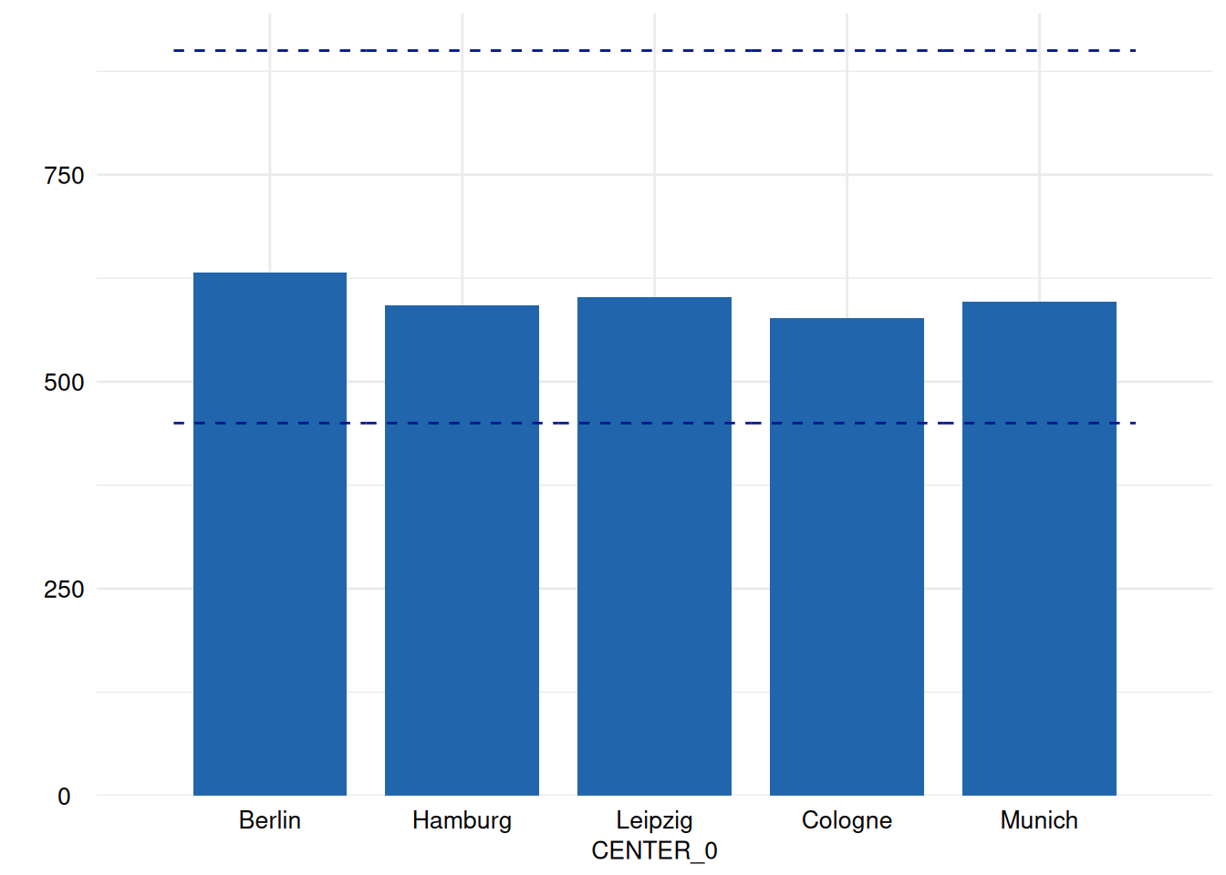
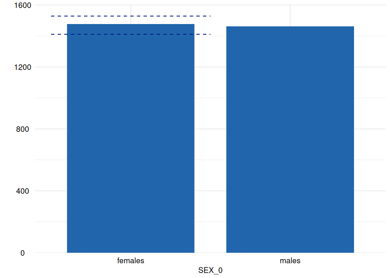
ex1 <- acc_distributions(resp_vars      = NULL,
                         label_col      = "LABEL",
                         study_data     = sd1,
                         meta_data      = md1)
This yields a set of 39 figures! All of which are lazy
ggplot2 objects:
unique(unlist(lapply(ex1$SummaryPlotList, class)))
#> [1] "dq_lazy_ggplot_s7"            "dataquieR::dq_lazy_ggplot_s7"
#> [3] "S7_object"
Lazy ggplot2 objects in dataquieR
In most situations, you do not need to worry about how
ggplot2 objects are created or handled — everything works
automatically in the background.
Starting with version 4.0.0, ggplot2
internally changed how plot objects are represented. To keep memory
usage low and to avoid unnecessary copying of large plot objects,
dataquieR now uses a lightweight placeholder for plots instead
of creating full ggplot2 objects immediately. You can think
of these placeholders as “delayed plots” that are only fully
created when they are actually needed.
This approach helps to:
- reduce memory consumption,
- improve performance for large reports,
- and avoid known problems related to saving or transferring full
ggplot2objects.
In most workflows, these delayed plots are automatically converted
into regular ggplot2 objects at the right time, and you
will never notice the difference.
However, in some special situations (for example when passing plots
to other packages or advanced custom code), a function may explicitly
expect a regular ggplot2 object. In such cases, you might
see error messages mentioning dq_lazy_ggplot.
If this happens, you can manually convert the delayed plot into a
standard ggplot2 object by calling:
dataquieR::prep_realize_ggplot(x)This forces the plot to be fully created and ensures compatibility with functions that require a plain ggplot2 object.
If you need to save memory, you can reduce the compatibility with
ggplot2 objects by setting the
option(dataquieR.lazy_plots_gg_compatibility = "FALSE").
Then, no expensive S7 classes are used for the promises,
but the final ggplot2 objects are nevertheless
S7 classes for ggplot2 >=
4.0.0. Also, you have to use
prep_realize_ggplot() more frequently, then.
Editing plots
There is a package named ggedit for editing
ggplot2-objects easily. Nevertheless, in the following the
basics to do so are discussed. For more complex adjustments, we
recommend now ggedit.
Lists of plots
To list them all, a simple print of the
ex1$SummaryPlotList can be used, but this will also print
the “normal” output of printing a list, i.e. the names or numbers of all
its elements. To avoid this, you can simply print each element of the
list separately:
# for (i in 1:length(ex1$SummaryPlotList)) # substituted by the next row to shorten the output of this vignette:
for (i in head(seq_along(ex1$SummaryPlotList), 4)) {
  print(ex1$SummaryPlotList[[i]])
}

Of course, an apply-iteration would be possible too, but for the means of plotting figures, the for loop perfectly fits.
Using this code, all figures are printed one below the other. To have
them in columns, the chunk-option out.width can be handy.
rmarkdown plots figures aside, if the current row is not
yet filled, so something like out.width=c('50%', '50%') can
be used to achieve a two-column image list.
Arrange plots
Another possibility to arrange list of plots is the
ggpubr package which handles a specific formal for lists of
ggplot2 objects.
ggpubr::ggarrange(plotlist = ex1$SummaryPlotList[1:4])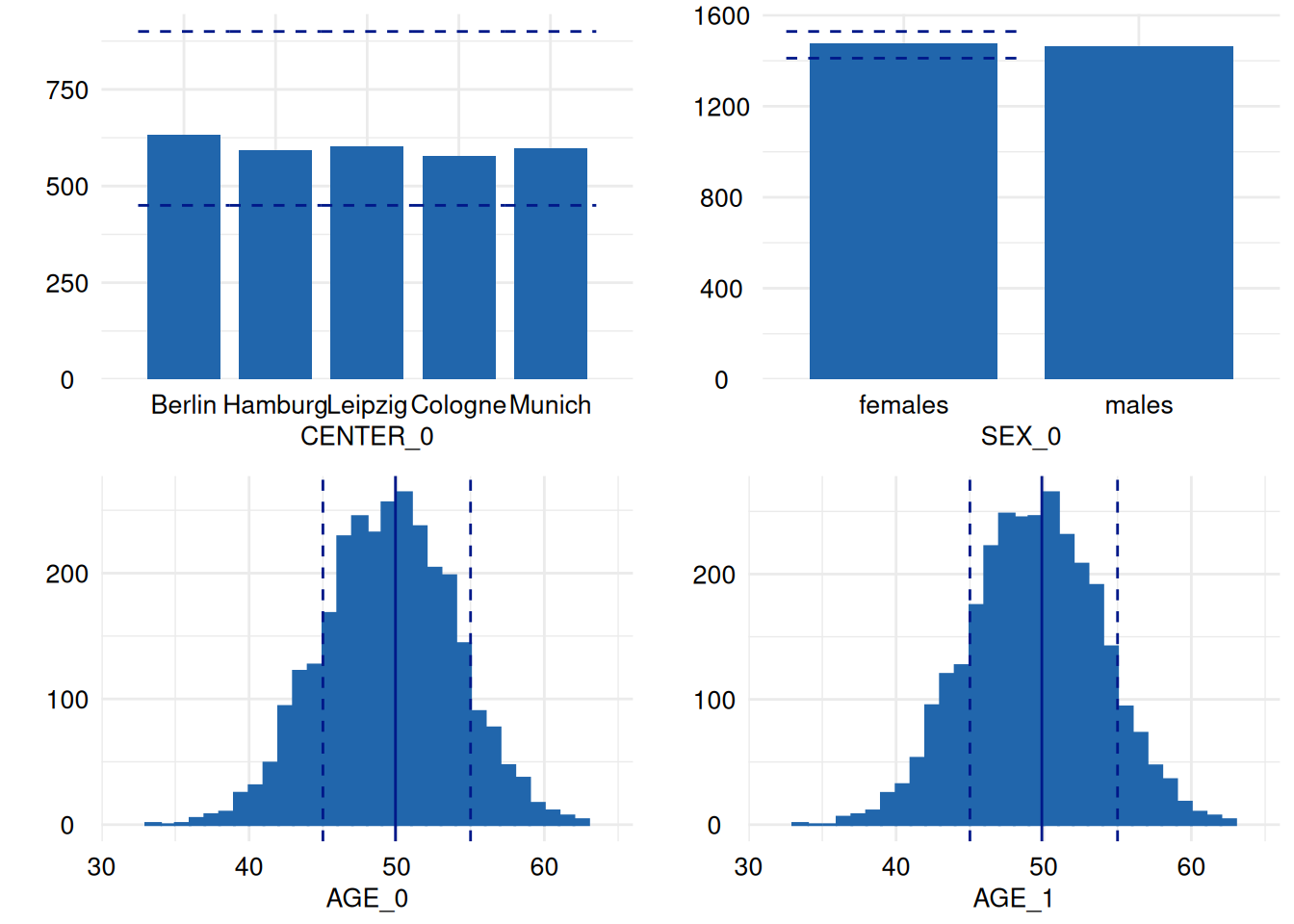
An alternative to ggpubris the
patchwork-package, which provides a very intuitive way of
aligning ggplot2 graphics:
library(patchwork)
p1 <- ex1$SummaryPlotList[[1]]
p2 <- ex1$SummaryPlotList[[2]]
p3 <- ex1$SummaryPlotList[[3]]

p1 | (p2 / p3)
See the
patchwork vignette for more details.
Plot rotation
The following example rotates the plot so that the counts appear in
the x-axis. For this, we can use the +-operator in
combination with the function coord_flip:
library(ggplot2)
print(
  ex1$SummaryPlotList[[3]] +
    coord_flip()
)
#> Coordinate system already present.
#> ℹ Adding new coordinate system, which will replace the existing one.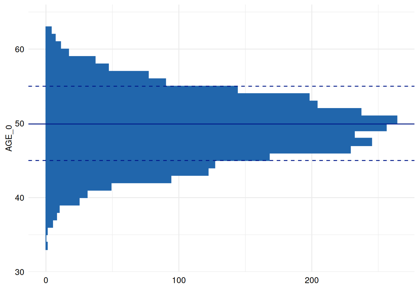
To add a red line, we use the annotate function to draw
objects not directly mapped (by aes) to specific data
points/samples (which avoids redundant plotting):
library(ggplot2)
print(
  ex1$SummaryPlotList[[3]] +
    coord_flip() +
    annotate("segment", x = -Inf, xend = Inf, y = 0, yend = 0, colour = "red")
)
#> Coordinate system already present.
#> ℹ Adding new coordinate system, which will replace the existing one.
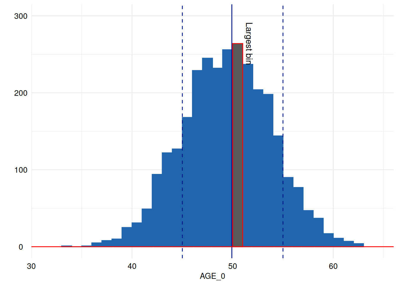
Highlighting
Then, we may like to highlight the largest bin in red. For this, we
need to access the bins calculated by geom_histogram which
the ggplot_build function makes accessible for
ggplot2-objects:
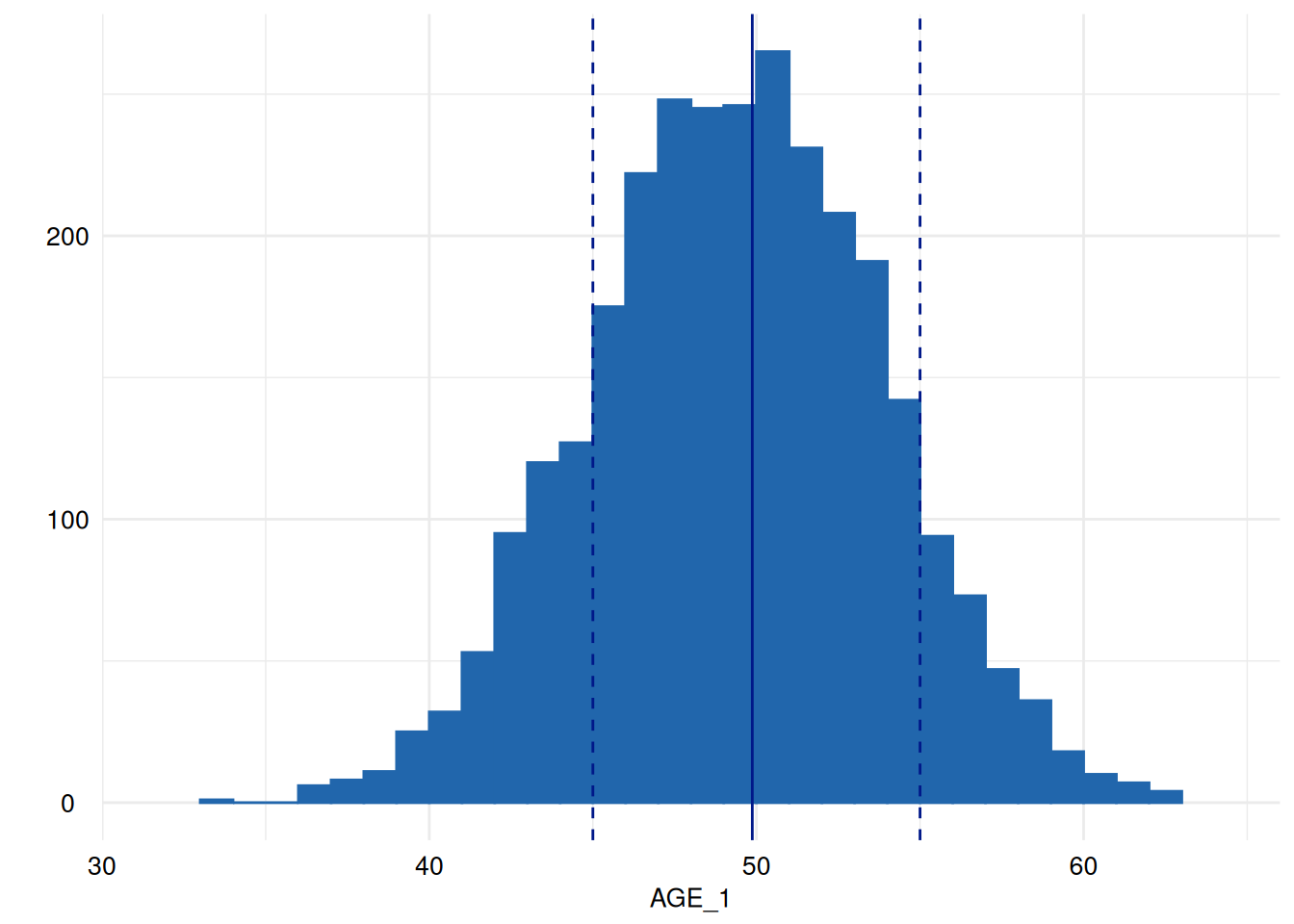
p <- ex1$SummaryPlotList[[3]] # choose the third figure generated by dataquieR.
x <- ggplot_build(p) # make its graphical properties accessible.
largest_bin <- which.max(x[["data"]][[1]][["y"]]) # find the largest bin.
print(x[["data"]][[1]][largest_bin, c("xmin", "xmax", "ymin", "ymax")]) # this would print out the cartesian coordinates of the largest bin.
#>    xmin xmax ymin ymax
#> 18   50   51    0  264
# see also the helpful contribution there: https://community.rstudio.com/t/geom-histogram-max-bin-height/10026
print( # print
  p +  # the plot
    annotate("segment", x = -Inf, xend = Inf, y = 0, yend = 0, colour = "red") + # annotate it with the red line again
    annotate("rect", # and highlight the largest bin by overplotting it with red framed black rectangle.
             xmin = x[["data"]][[1]]$xmin[[largest_bin]],
             xmax = x[["data"]][[1]]$xmax[[largest_bin]],
             ymin = x[["data"]][[1]]$ymin[[largest_bin]],
             ymax = x[["data"]][[1]]$ymax[[largest_bin]], color = "red")
)
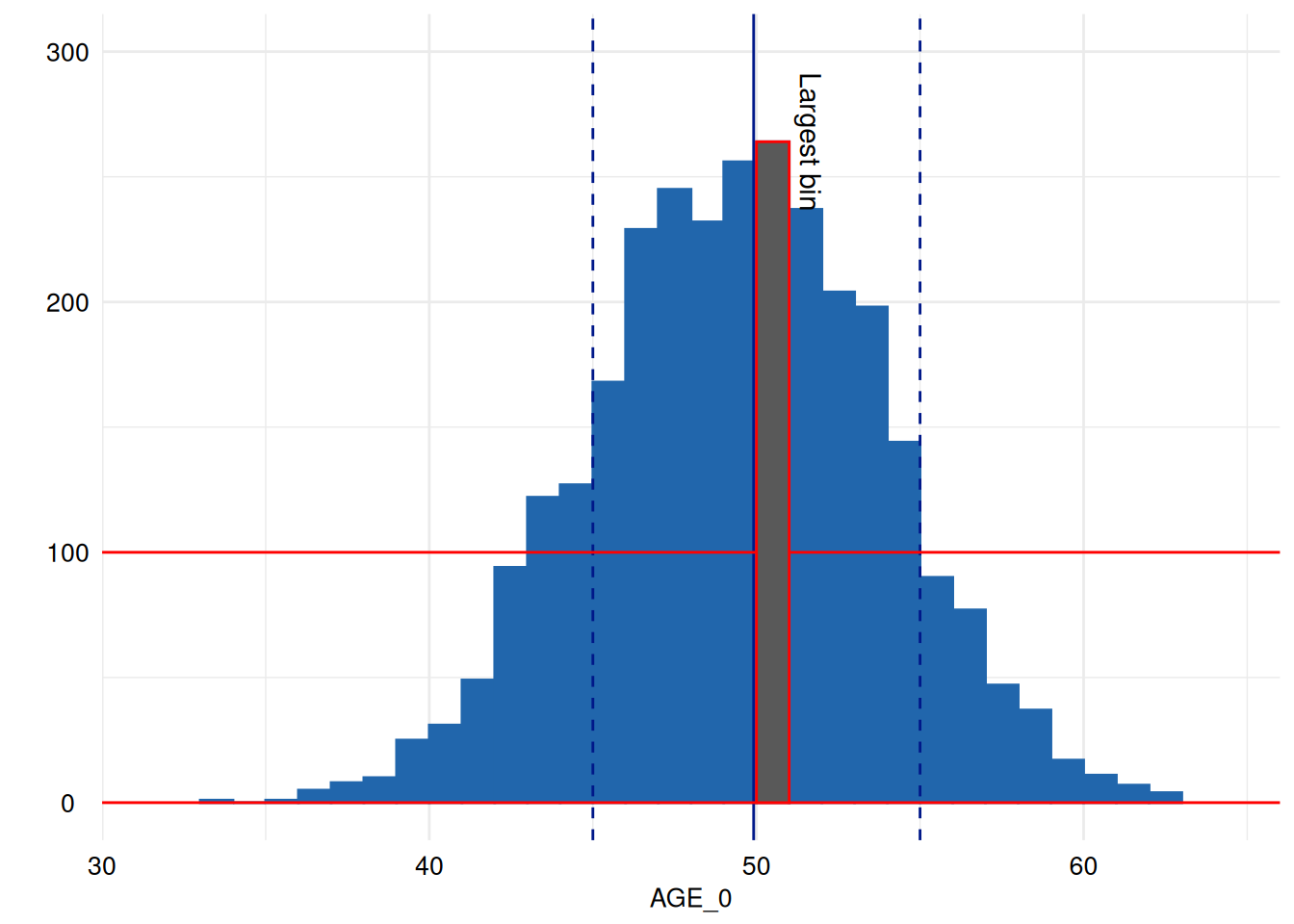
Annotation
Unfortunately, the annotate function’s documentation is
sparse. The geom-parameter refers to existing
implementations of graphics in ggplot2 all of which are
prefixed with geom_. Usually they extract their coordinates
from the data using the mapping given in the aes-parameter
of the whole ggplot2 object or for the specific
geom. text is a useful geom for
annotating the plot:
print( # print
  p +  # the plot
    scale_y_continuous(limits = c(0, 300)) +  # expand y-axis to make annotations visible
    annotate("segment", x = -Inf, xend = Inf, y = 0, yend = 0, colour = "red") + # annotate it with the red line again
    annotate("rect", # and highlight the largest bin by overplotting it with red framed black rectangle.
             xmin = x[["data"]][[1]]$xmin[[largest_bin]],
             xmax = x[["data"]][[1]]$xmax[[largest_bin]],
             ymin = x[["data"]][[1]]$ymin[[largest_bin]],
             ymax = x[["data"]][[1]]$ymax[[largest_bin]], color = "red") +
    annotate("text", label = "Largest bin", x = x[["data"]][[1]]$xmax[[largest_bin]], y = x[["data"]][[1]]$ymax[[largest_bin]], angle = 270, vjust = -.5)
)
You may see the documentation of ggplot2::annotate for
some examples.
Coordinates are given in the same coordinate system that is shown in
the plot, so drawing a line at 100 observations is as easy
as directly choosing 100 as y coordinate.
print( # print
  p + # the plot
    scale_y_continuous(limits = c(0, 300)) +  # expand y-axis to make annotations visible
    annotate("segment", x = -Inf, xend = Inf, y = 100, yend = 100, colour = "red") + # annotate it with the red line again
    annotate("segment", x = -Inf, xend = Inf, y = 0, yend = 0, colour = "red") + # annotate it with the red line again
    annotate("rect", # and highlight the largest bin by overplotting it with red framed black rectangle.
             xmin = x[["data"]][[1]]$xmin[[largest_bin]],
             xmax = x[["data"]][[1]]$xmax[[largest_bin]],
             ymin = x[["data"]][[1]]$ymin[[largest_bin]],
             ymax = x[["data"]][[1]]$ymax[[largest_bin]], color = "red") +
    annotate("text", label = "Largest bin", x = x[["data"]][[1]]$xmax[[largest_bin]], y = x[["data"]][[1]]$ymax[[largest_bin]], angle = 270, vjust = -.5)
)
We will now rotate the annotation:
p2 <-  p +  # the plot
    annotate("segment", x = -Inf, xend = Inf, y = 100, yend = 100, colour = "red") + # annotate it with the red line again
    annotate("segment", x = -Inf, xend = Inf, y = 0, yend = 0, colour = "red") + # annotate it with the red line again
    annotate("rect", # and highlight the largest bin by overplotting it with red framed black rectangle.
             xmin = x[["data"]][[1]]$xmin[[largest_bin]],
             xmax = x[["data"]][[1]]$xmax[[largest_bin]],
             ymin = x[["data"]][[1]]$ymin[[largest_bin]],
             ymax = x[["data"]][[1]]$ymax[[largest_bin]], color = "red") +
    annotate("text", label = "Largest bin", x = x[["data"]][[1]]$xmax[[largest_bin]], y = x[["data"]][[1]]$ymax[[largest_bin]], angle = 0, vjust = -.5)
suppressMessages(p2 + coord_cartesian()) # this restores the original cartesian coordinate system replacing the flipped one introduced by acc_distributions However, it emits a message about replacing the coordinate system, which we can suppress here with suppressMessages.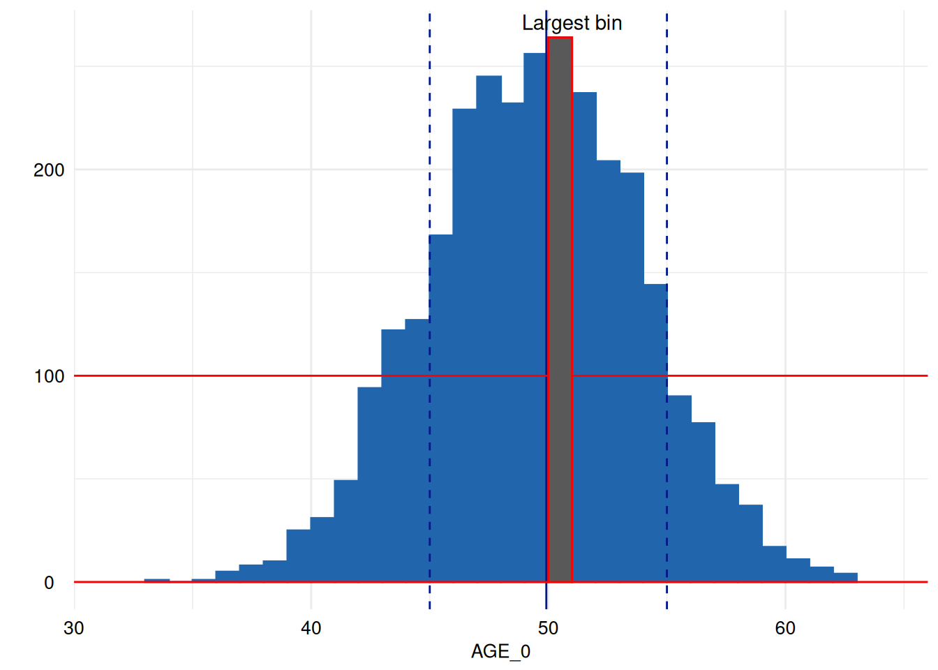
# Note, that neither `ggplot2::coord_flip` nor `ggpubr::rotate` can solve this
# issue. These functions are not aware of already-rotated plots, so the following
# will *not* rotate the plot back:
#
# ```{r}
# p2 + coord_flip()     # does not rotate the plot but prints
#                       # Coordinate system already present. Adding new coordinate
#                       # system, which will replace the existing one.
#
# p2 + ggpubr::rotate() # does not rotate the plot but prints
#                       # Coordinate system already present. Adding new coordinate
#                       # system, which will replace the existing one.
# ```
Add new data
All functions of the dataquieR use the data as they are
imported, i.e. variables of the study data can be examined and used for
grouping/stratification of results. All information for these variables
must be attached to the metadata. In some situations, particularly
during data quality reporting, it is necessary to use new
calculated/transformed variable. Naturally, respective information is
not defined in the metadata. This peculiarity would preclude the use of
such calculated or transformed variables in data quality reporting.
To illustrate the need of a helper function is shown with the
following example from com_segment_missingness():
MissSegs <- com_segment_missingness(study_data = sd1,
                                    meta_data = md1,
                                    threshold_value = 1,
                                    color_gradient_direction = "above",
                                    exclude_roles = c("secondary", "process"))
The SummaryPlot shows the frequency of observations in which all measurements of respective study segments are missing.
MissSegs$SummaryPlot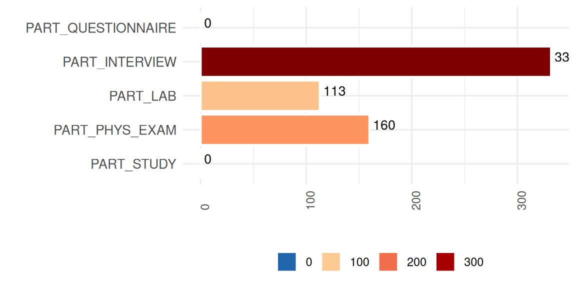
Exploring the segment missingness over time
would require another variable in the study data. We will generate such
a variable using the lubridate package.
sd1$exq <- as.integer(lubridate::quarter(sd1$v00013))
table(sd1$exq)
#>
#>   1   2   3   4
#> 724 713 776 727
Information regarding this variable is then added to a copy of the
metadata (md2) using the dataquieR
function prep_add_to_meta():
md2 <- dataquieR::prep_add_to_meta(VAR_NAMES = "exq",
                                   DATA_TYPE = "integer",
                                   LABEL = "EX_QUARTER_0",
                                   VALUE_LABELS = "1 = 1st | 2 = 2nd | 3 = 3rd | 4 = 4th",
                                   VARIABLE_ROLE = "process",
                                   MISSING_LIST = NA,
                                   meta_data = md1)
MissSegs <- com_segment_missingness(study_data = sd1,
meta_data = md2,
threshold_value = 1,
label_col = LABEL,
group_vars = "EX_QUARTER_0",
color_gradient_direction = "above",
exclude_roles = "process")
MissSegs$SummaryPlot